Thank you! Your submission has been received!
Something went wrong while submitting the form, please try again.

client:
Kyivstar
Industry:
Telecommunications
timeline:
4 weeks (2026)
my role:
Lead UI/UX Designer
Kyivstar is the largest telecommunications operator in Ukraine, providing mobile communication and data services to over 22.4 million mobile subscribers and more than 1.1 million Home Internet subscribers as of June 2025.
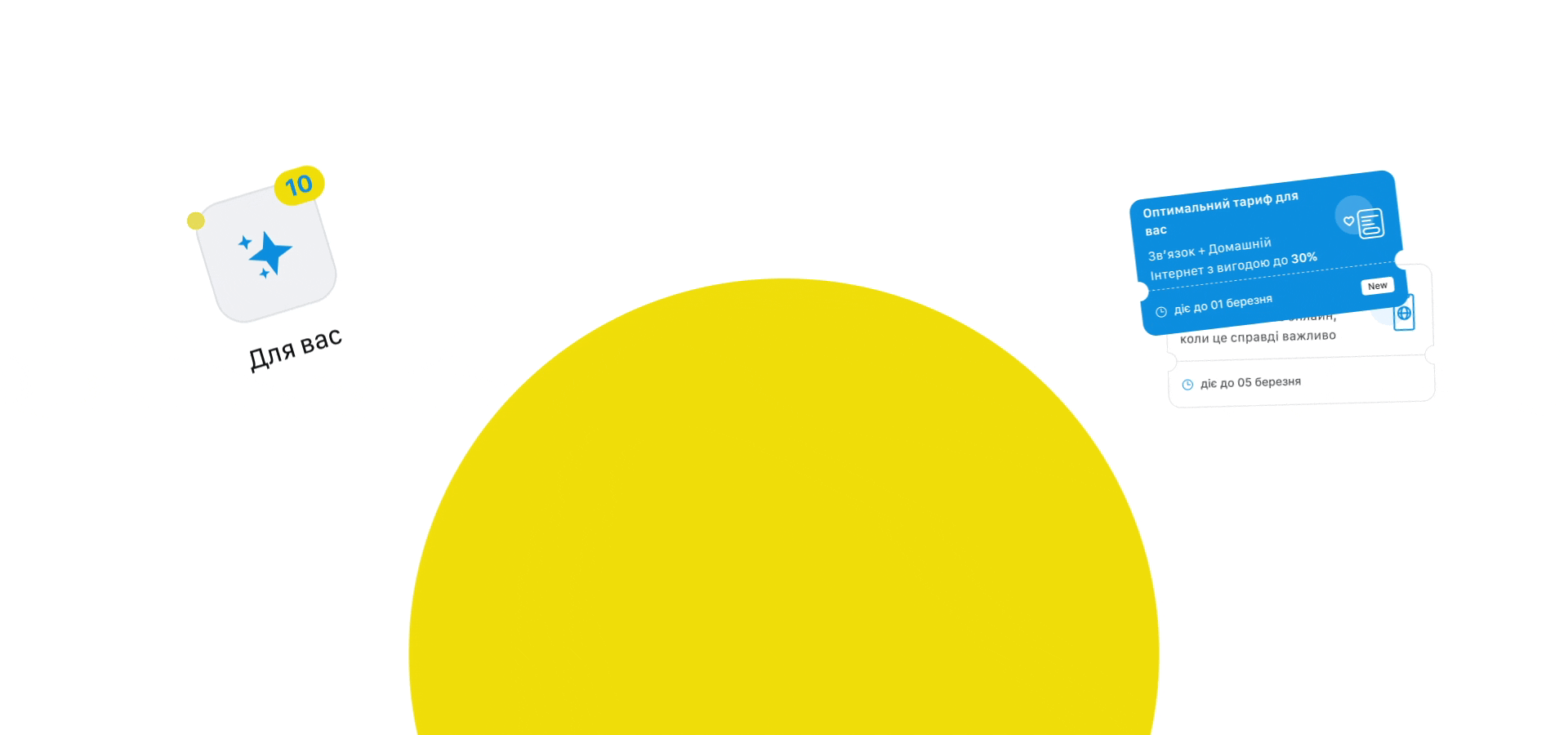
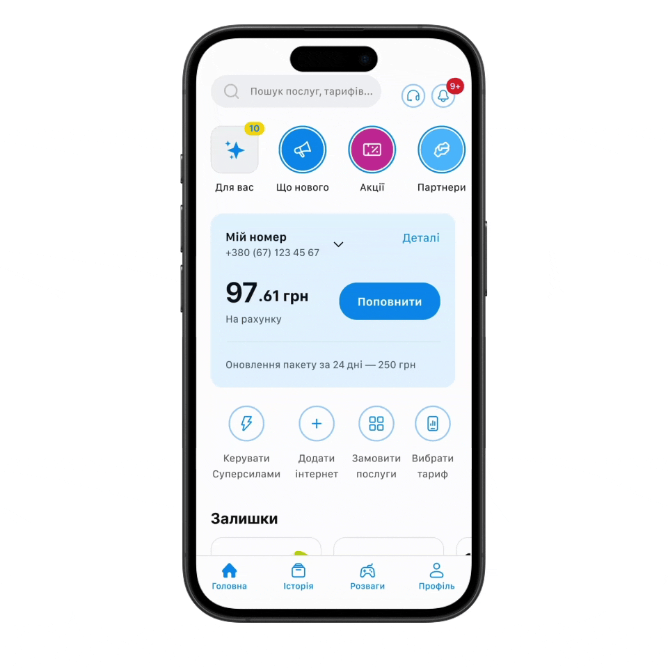
Task was to Consider the best placement for the Personal Offers block so more people see it. display offers when there are about 10 of them (currently max 5). Increase the conversion rate for connecting to offers. Currently – 30%.
Double-diamond design process
Discover
1. Competitor Analysis – analyzed how competitors solve similar tasks. Documented key screens in FigJam, identified strengths and weaknesses, and summarized insights into opportunities.
2. Feedback Analysis – Reviewed six months of app store feedback and clustered recurring issues into Affinity map.
3. Moderated Usability Testing of the Current App – Ran guided sessions to observe user behavior, measured time on task to find the target block, and collected ease-of-use ratings.
Define
4. Actionable insights – Identified frequent responses that enabled informed decision-making. Plus generated additional ideas.
5. Impact–Effort Matrix – Prioritized ideas by evaluating their potential impact versus implementation effort to select the most valuable and feasible solutions.
Develop
6. Design – Created high-fidelity designs aligned with user needs in two versions A / B.
7. Prototypes – Build interactive prototypes to validate solutions.
Deliver
8. Moderated and Unmoderated Comparative Usability Testing – Testing new solutions against the previous version to measure improvements in usability, performance, and user satisfaction.


Hypothesis
We assume that users do not notice or underestimate personal Offers block in the current app because it is located in a non-obvious place and does not look clickable.
We will confirm this if at least half of the respondents cannot find the block on their own, do not open it, or mention that the block is problematic.
Respondents — 8 users
Top-3 Actionable insights
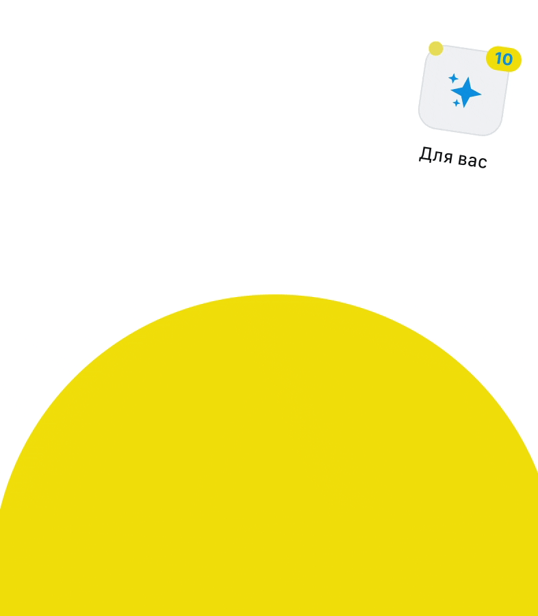
1. All users noticed the Stories and suggested organizing them. this area could potentially be used for personal offers.
2. Most users are aware of personal offers and can find it, but they do not perceive the value of the offers.
3. The offers should be integrated into other flows so that users see them at the right moment.


Hypothesis
We assume that users will find personal offers faster in the redesigned version than in the current version of the app.
We will confirm this if the Time on Task decreases.
Moderated testing — 8 users
Unmoderated testing — 31 users
Findings
We considered option A with stories based on research and Option B as well, placing the banner in a location familiar to users. However, based on the results, Option A with stories showed better performance metrics.
Option A — 100% success rate, 0:14 / 0:32 time on task.
Option B — 81.8% success rate, 1:13 / 0:49 time on task.
Therefore, Option A was more effective — 89% Faster Access to Personal Offers compared to the current app.


Research showed — replacing offers closer to the stories gave 100% success rate and enabled 89% faster access compared to the current app.
Personalized offers are shown on a dedicated, filterable page supporting 10+ cards. Conversion may improve due to the new placement, more attractive deals, expiration dates, and “coming soon” offers.
The project concluded with a strategic presentation to stakeholders, including additional product recommendations such as integrating offers into other flows, simplifying navigation, testing offline essentials and refining overall app compactness.
client:
Kyivstar